Physical Address
304 North Cardinal St.
Dorchester Center, MA 02124
Physical Address
304 North Cardinal St.
Dorchester Center, MA 02124

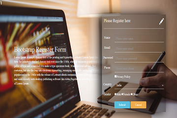
In this tutorial, we will design a (bootstrap 3 responsive registration form), you can use this bootstrap form in every project especially user registration or user login part this is a basic requirement of every project, step by step with the help of :
Bootstrap 3
Html 5
CSS
You can download or use the Direct CDN file of bootstrap
Cdn Link: click here
<!DOCTYPE html>
<html lang="en">
   <head>
      <title>Bootstrap Registration login form</title>
      <meta charset="utf-8">
      <meta name="viewport" content="width=device-width, initial-scale=1">
      <link rel="stylesheet" href="https://maxcdn.bootstrapcdn.com/bootstrap/3.4.1/css/bootstrap.min.css">
      <link rel="stylesheet" href="style.css">
      <script src="https://ajax.googleapis.com/ajax/libs/jquery/3.5.1/jquery.min.js"></script>
      <script src="https://maxcdn.bootstrapcdn.com/bootstrap/3.4.1/js/bootstrap.min.js"></script>
   </head>
   <body>
      <div class="container">
         <div class="row">
            <div class="col-md-7">
               <h1 class="text-left">Bootstrap Register Form</h1>
               <p class="text-left">Lorem Ipsum is simply dummy text of the printing and typesetting industry. Lorem Ipsum has been the industry's standard dummy text ever since the 1500s, when an unknown printer took a galley of type and scrambled it to make a type specimen book. It has survived not only five centuries, but also the leap into electronic typesetting, remaining essentially unchanged. It was popularised in the 1960s with the release of Letraset sheets containing Lorem Ipsum passages, and more recently with desktop publishing software like Aldus PageMaker including versions of Lorem Ipsum.
               </p>
            </div>
            <div class="col-md-5">
               <!--make 2 columns of 6 -->
               <div class="row">
                  <div class="col-md-6">
                     <h3 class="text-left">Please Register here</h3>
                  </div>
                  <div class="col-md-6">
                     <span class="glyphicon glyphicon-pencil"></span>
                  </div>
               </div>
               <hr>
               <!-- make another column for textbox and label -->
               <div class="row">
                  <label class="label col-md-2 control-label">Name</label>
                  <div class="col-md-10">
                     <input type="text" class="form-control" name="name" placeholder="Please enter name">
                  </div>
               </div>
               <div class="row">
                  <label class="label col-md-2 control-label">Email</label>
                  <div class="col-md-10">
                     <input type="email" class="form-control" name="email" placeholder="Please enter email">
                  </div>
               </div>
               <div class="row">
                  <label class="label col-md-2 control-label">Password</label>
                  <div class="col-md-10">
                     <input type="password" class="form-control" name="password" placeholder="Please enter password">
                  </div>
               </div>
               <div class="row">
                  <label class="label col-md-2 control-label">Phone</label>
                  <div class="col-md-10">
                     <input type="text" class="form-control" name="phone" placeholder="Please enter phone">
                     <input type="checkbox" name="chbox"><small>Privacy Policy</small>
                  </div>
               </div>
               <div class="row">
                  <label class="label col-md-2 control-label">Country</label>
                  <div class="col-md-10">
                     <select class="form-control">
                        <option value="">India</option>
                        <option value="">Japan</option>
                        <option value="">India</option>
                        <option value="">America</option>
                        <option value="">Brazil</option>
                     </select>
                  </div>
               </div>
               <div class="row">
                  <label class="label col-md-2 control-label">Gender</label>
                  <div class="col-md-10">
                     <input type="radio" name="gn" value="male"><small>Male</small>
                     <input type="radio" name="gn" value="female"><small>Female</small>
                     <input type="radio" name="gn" value="other"><small>Other</small>
                  </div>
               </div>
               <a href="">
                  <div class="btn btn-info">Submit</div>
               </a>
               <a href="">
                  <div class="btn btn-warning">Cancel</div>
               </a>
            </div>
         </div>
      </div>
   </body>
</html>
just create a CSS file: style.css for the styling of the HTML page and include it on your HTML file
Note: you can change form background image in style.css
background-image: url(back.jpg);
*{
	margin: 0px;
	padding: 0px;
}
body{
	background-image: url(back.jpg);
	background-size: cover;
	background-attachment: fixed;
	font-family: new time roman;
}
h1{
	font-size: 40px;
	color: white;
	margin-top: 250px;
}
p{
	font-size: 17px;
	color: white;
}
h3{
	font-size: 25px;
	color: white;
}
.glyphicon-pencil{
	font-size: 35px;
	color: white;
	float: right;
	margin-top: 20px;
}
.col-md-5{
	margin-top: 80px;
	box-shadow: -17px 1px 60px black;
	background: rgba(0,0,0,0.4);
}
.label{
	font-weight: normal;
	margin-top: 15px;
	color: white;
	font-size: 19px;
}
.form-control{
	background: transparent;
	border-radius: 0px;
	border: 0px;
	border-bottom: 1px solid white;
	font-size: 18px;
	margin-top: 15px;
	height: 40px;
	color: white;
}
input[type="checkbox"]{
	margin-top: 15px;
	width: 15px;
	height: 15px;
}
small{
	font-size: 18px;
	color: white;
}
input[type="radio"]{
	margin-top: 22px;
}
option{
	color: grey;
}
.btn-info{
	margin-top: 20px;
	font-size: 18px;
	width: 120px;
	margin-left: 80px;
	margin-bottom: 20px;
}
.btn-warning{
	margin-top: 20px;
	font-size: 18px;
	width: 120px;
	margin-bottom: 20px;
}
So in this tutorial, we learned to design- bootstrap 3 responsive registration form
Read also: How to add datatables in html table ?
